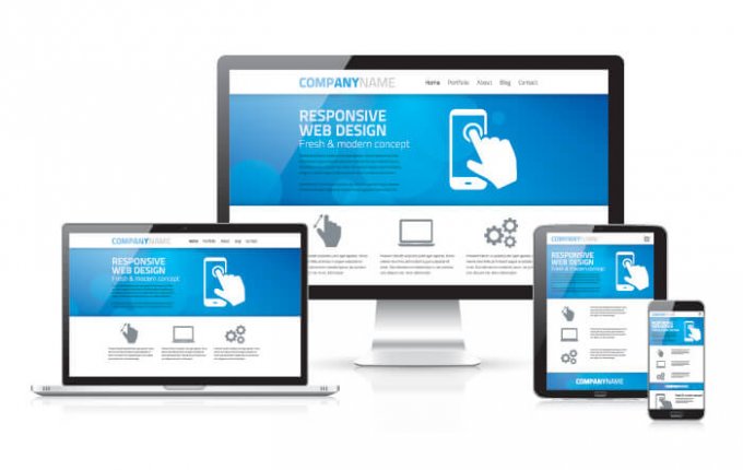
A website is responsive when mobile and tablet devices see a customized view of your website that is created “on the fly” depending on the size of the screen of the visitor. In responsive design, images are resized and website columns are stacked one on top of the other, instead of being displayed side-by-side. If the design of a website looks exactly the same on a phone as it does on your desktop, and you need to zoom in to read the type, it is not responsive.
Common properties of Responsive Web Design (RWD) are:
- images and logos that resize to fit the screen
- menus that shrink to size or require a click to view
- text that reflows to fit the screen
- sidebar columns that stack one on the other when the screen shrinks
To see how your site looks on multiple screen sizes, take a look at this responsive tool from StudioPress.
